Jocelyn Sutherland
@JKSuth
Children are growing up in an increasingly visual world, yet many still struggle to convey ideas and understanding in a comprehensive way. Design is everywhere and more than ever, students need to understand the principles of design to communicate effectively.
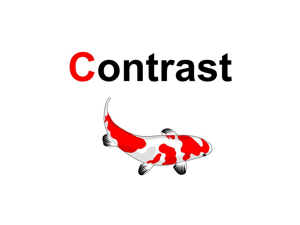
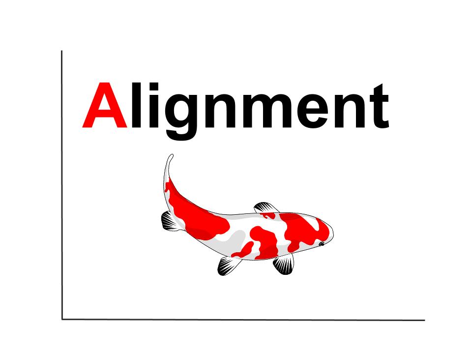
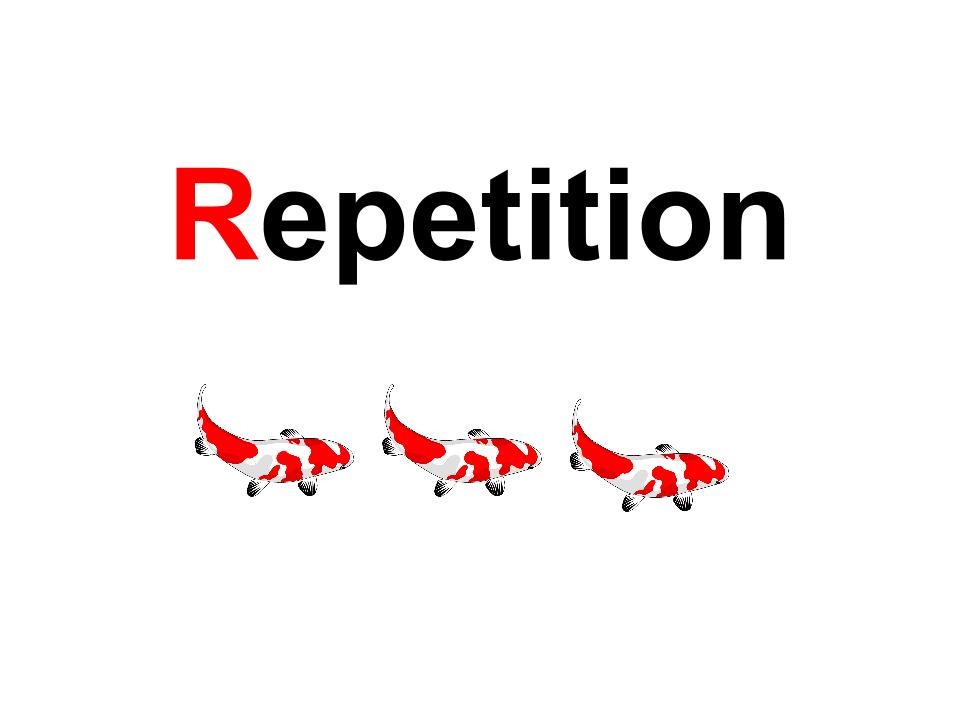

As the K-5 EdTech Coach, I noticed there was a lack of design thinking happening across all grade levels. Thanks to Keri-Lee Beasley’s Design Secrets Revealed eBook I was able to support upper primary teachers in their quest to address these design challenges in G3-G5. But I wondered if G3 was too late to be introducing the four main principles of Contrast, Alignment, Repetition and Proximity (C.A.R.P)? Children were creating and designing posters and eBooks right from Kindergarten. But are the C.A.R.P terms too advanced and complex for early readers? I immediately thought of young children’s fascination with dinosaurs, and recalled my younger brother (nearly 30 years ago) using their latin names like ‘Dilophosaurus’ before he could properly read. I figured, if young children can learn long complicated dinosaur names, the only thing stopping young children from learning the C.A.R.P principles was us, their teachers.

Below is a copy of my Final UbD Project.
Carp Jr: Redefining Design Principles for KG-G2
Since this unit is designed for young children in KG-G2, I decided to use a variety of devices and tools to teach these concepts. The primary platform I used to design and deliver the lessons was Google Slides, because it allowed me to access Creative Commons Attribute Free images, and the collaborative feature allowed me to share the lessons easily with staff in the school, and beyond. Teachers who choose to use these resources can also make copies and modify them for their class.

![]()
Public Domain Logo: CC image from Wikipedia
What were your goals for your lesson/project?
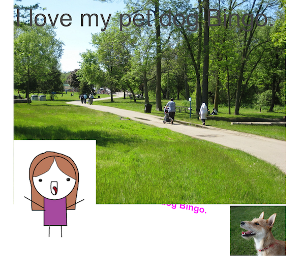
To introduce the CARP design principles with students and create a collaborative eBook with students explaining the CARP principles for others to use. Below are examples of the 4 posters I created using Google Slides.
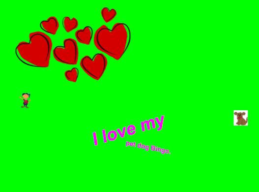


What tools did you use? Why did you choose these tools for this task?
I used Google Slides to share the presentations and activities across classes. I also used Google Docs to collaborate, plan and reflect on week-by-week activities. Below is an example of the collaborative planning document I used with the classroom teachers:
For planning, we also used Keri-Lee Beasley’s “Design Secrets Revealed” ebook to support and plan for the lessons, as well as several other websites & resources outlined in my UbD Unit Outline.
For the summative task, students had the opportunity to use the My Story or Chatterpix app to showcase their understanding of CARP. They created a visual text to be shared on the ePortfolio platform, SeeSaw.


How did you go about introducing your lesson/project?
I first needed to propose this project to a teacher who would be willing to collaborate on it. In my role as EdTech Coach, I am responsible for planning with teachers on ways to integrate EdTech in the classroom. Two grade 1 teachers were happy to bring these new concepts (CARP) into their classroom as students were just beginning a unit on visual literacy.
How did the students react?
Students were very engaged in the lessons as they were a mix of inquiry and hands-on practice. Many of the students are developing into confident readers so they enjoyed learning new vocabulary. Students were even able to apply their learning in a broader context. According to the classroom teacher, words like ‘Alignment’ were being used to describe how work books were organised; During math lessons when children were ‘aligning’ their work and answers. One student had commented that they didn’t know there were “real words for the way things looked”.
Outcome? Did you meet your goals?
While the lessons took longer than expected, the ultimate goal of exposing students to the CARP principles was met. As my final video (below) shows, several of the students adopted the terminology and were able to explain their visual texts using the language of Design Principles. Unfortunately, due to time constraints and extenuating circumstances, we were unable to create the culminating eBook. Instead, students produced a visual text using one of the iPad apps: Chatterpix, My Story or PicCollage. They implemented as many CARP principles as they could remember and then explained them orally.
Evidence of learning
My final video best documents the learning achieved by students over the course of the 6 week unit:
https://youtu.be/h-d_-6wBpdU
Here is a reflection from one of the G1 teachers:
“I’ve been surprised that the students were able to grasp the principles. This came from some trial and error with simplifying and scaffolding activities that would give them practice with identifying first and then replicating the different principles. We worked mostly with Contrast and Alignment, not only because they’re the first, but also because they were a little more concrete for the students. Also, having posters with examples in the classroom to refer to often reminds them of the principles in different contexts/disciplines.
I’ll definitely teach and use CARP principles with my classes in the future. It really helps them to have experience seeing the difference between good design and poor design, even at this young age. It motivates and empowers them to improve the design in their own work!” ~ H.M Grade 1 Class Teacher
What would you do differently next time? What did you learn?
Overall this experience was really successful and the teachers and students got a lot out of it. However, in future I would prefer to run this with my own classroom. As the EdTech Coach, there is only so much I can do between lessons, and often there were extenuating circumstances that arose and caused lesson time to be cut short or rescheduled. While the teachers I collaborated with were very accommodating and flexible, if we were unable to finish the lesson it was challenging to pick up where we last left off because too much time had passed. I think this unit is best adopted by a classroom teacher in KG-G2, as they can tweak the resources to suit their class needs, and also they can plan out and deliver the lessons in a more timely manner. Also, there were three teachers working with me, and each teacher had a slightly different approach to embedding the CARP design principles in their classroom routines. The more successful classes had a clear display board that was regularly referenced to when teachers were looking at other visual texts, or any designs where these 4 principles could be applied.
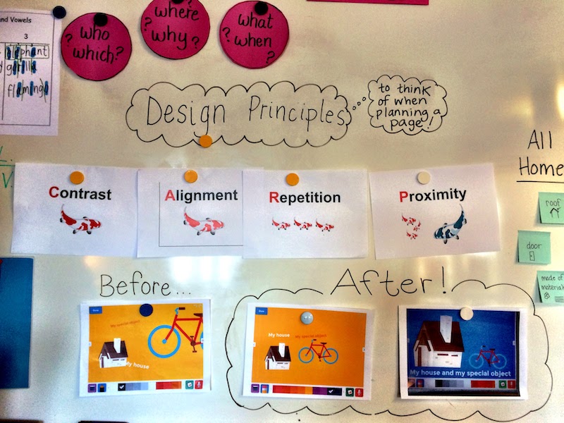
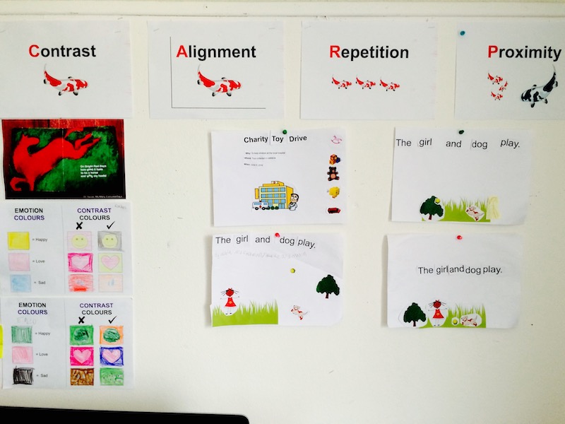
I also learned the importance of flexibility and lesson ‘tweaking’, since ultimately we were unable to reach our goal of publishing a CARP Jr Design Principles eBook by week 6. However this is still something we hope to do in May/June. Instead, students had the opportunity to publish a visual text that showcased some or all of the CARP principles, and the teachers were satisfied with this as a reflection of student understanding. I do think a classroom teacher has the benefit of time to ensure the outcome of an eBook. Next year when I am back in grade 5 as classroom teacher at UWCSEA, I look forward to implementing a similar unit with my own students.
How do you plan to share this with your colleagues?
Everything I created has been shared through Google Drive and is stored in this folder. These resources are free for teacher use around the globe. I will embed these resources on a separate tab in my COETAIL blog. I will also promote this unit and the resources through the collaborative team meetings I attend each week, and through #coetailchat, #edtechchat, #1stchat on Twitter.
What was your greatest learning in this course?
The learning that was most influential for me during Course 5 was how concepts from the other courses intersected in this culminating final project. Creating the Carp Jr. unit on design also allowed me to rethink and redefine tasks using digital tools such as MyStory.
My growing PLN has been another great source of learning for me, and I am in awe of the numerous amazing projects and initiatives taking place by Coetail students and graduates. I also learnt that a paradigm shift is needed in education, and no one educator can make the shift happen on their own. We need to bond together as like-minded educators and work to change pedagogy. I look forward to continuing these relationships through Twitter and G+ communities after Coetail ends.
Did this implementation meet the definition of Redefinition?
This is my favourite visual of the SAMR model, created by Sylvia Duckworth:

Redefinition is defined as allowing “for the creation of new tasks, previously inconceivable”. While many of the concepts learned throughout this CARP Jr unit were ‘analogue’, students did create a summative Visual Text about CARP principles using a digital tool (one of the apps on the iPad). The analogue tasks were also paired with a digital eBook (Keri-Lee Beasley) and the collaborative planning documents and Google Slides. This is an example of redefinition because students combined media from a variety of sources, such as drawings, photos and digital images, to create a final visual text that exhibited elements of CARP. The camera allowed them to document their ‘analogue’ work in a digital format, which is inconceivable without iPad or digital device. The iPad also allowed them to add their own narration to explain their thinking (My Story & Chatterpix).
Final Thoughts about the Final Project
Overall the experience of delivering this unit was very positive and full of challenges. I developed stronger relationships with the G1 teachers I worked with, and was able to tweak my resources as I went so that they could be more accessible and practical for other teachers to use.
Recently I had the privilege of attending and facilitating a cohort of teachers at Europe’s first Learning 2.0 Milan. There were so many important messages to take away but perhaps the one that resonates most with me and this final project is the importance of Failure in the learning journey. Jeff Utecht shared this during his final presentation: “FAIL = First Attempt In Learning”.

Photo Credit: Me. Jeff Utecht @Learning2 Europe
At the start of this unit, I wasn’t sure if I would be successful implementing a six-week long Design Principles unit with 5-7 year olds. However, I realise I needed to implement this unit (through trial & error) to really understand how it can best be used in the classroom. The video shows that students learned and applied these concepts at an age-appropriate level, and with these tools they will be better prepared to tackle design in upper grades as well. I hope those who choose to use this unit in their own classroom can benefit from my experience, and my mistakes.
All Resources for CARP JR Design Unit can be found below:
Want to read more of Jocelyn’s COETAIL journey?



Recent Comments